Amador
Examining the history, characteristics, and impact of a typeface

Examining the history, characteristics, and impact of a typeface
Amador
Examining the history, characteristics, and impact of a typeface
Amador

Introduction //
Amador is a 54-page typeface specimen book exploring the font with the same name, including its history, letterforms, and its most well-known application in the 2017 film, Lady Bird.
Created by type designer Jim Parkinson, Amador is a blackletter typeface that blends traditional hand lettering techniques with what he describes as a “modern Californian influence.” I was initially drawn to blackletter typefaces for their decorative qualities, and quickly fell in love with Amador’s structure and elegance.
Project
Academic
Software
Adobe InDesign, Photoshop
Timeline
3 weeks
Role
Typeface Research, Layout Design, Print Production
Project Objectives
01.
Research the typeface’s history and designer background
02.
Study and document the formal qualities of the letterforms
03.
Develop an engaging theme to inform the visual design of the book
Project Objectives
01.
Research the typeface’s history and designer background
02.
Study and document the formal qualities of the letterforms
03.
Develop an engaging theme to inform the visual design of the book
05.
Objective 5
Project Objectives
01.
Research the typeface’s history and designer background
02.
Study and document the formal qualities of the letterforms
03.
Develop an engaging theme to inform the visual design of the book
05.
Objective 5
Concept Development //
The visual narrative for the book was styled after the coming-of-age film Lady Bird, reflecting the film’s emotional complexity while remaining structured and dynamic.
I watched the film repeatedly throughout the design process, immersing myself in the film’s tone and creating a smooth transition when designing my own compositions. Additionally, I had the opportunity to speak with Delve Withrington, a close friend and colleague of Jim Parkinson. He shared unpublished writings about Amador authored by Parkinson himself, which provided deeper insight into the typeface’s origins and development.


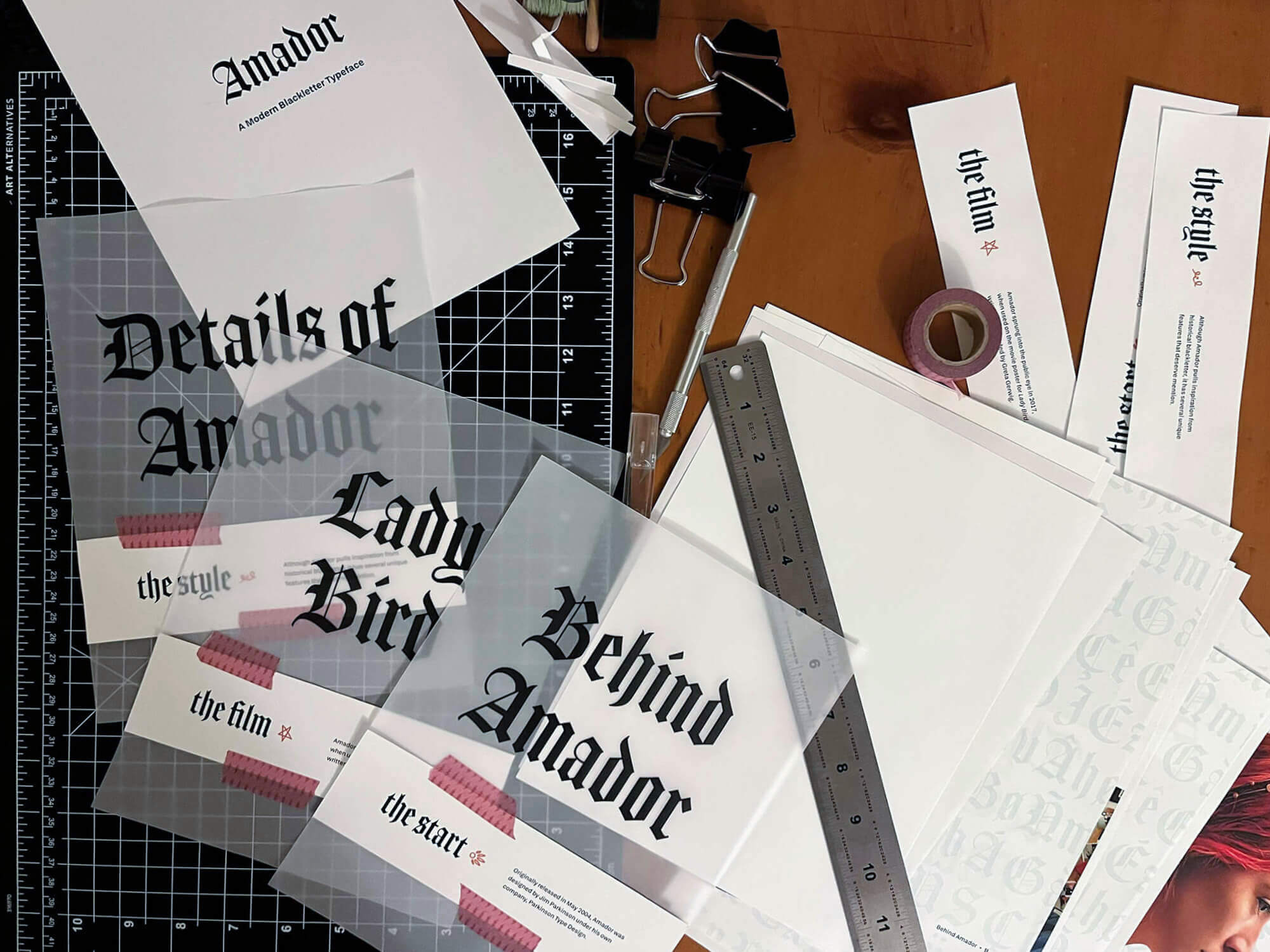
Cover Cutout & Vellum Print.
Paper Inserts & Layered Vellum Pages.


Cover Cutout & Vellum Print.
Paper Inserts & Layered Vellum Pages.
Cover Cutout & Vellum Print.
Paper Inserts & Layered Vellum Pages.
Binding
The final booklet was produced in both digital and physical formats, with the physical being hand-bound using a double-fan glue binding technique. Vellum pages were incorporated throughout the book to introduce layering, depth, and a tactile quality to the reading experience.
Binding
The final booklet was produced in both digital and physical formats, with the physical being hand-bound using a double-fan glue binding technique. Vellum pages were incorporated throughout the book to introduce layering, depth, and a tactile quality to the reading experience.
Binding
The final booklet was produced in both digital and physical formats, with the physical being hand-bound using a double-fan glue binding technique. Vellum pages were incorporated throughout the book to introduce layering, depth, and a tactile quality to the reading experience.
Outcome //

The research and development of this specimen book highlights the importance of a typeface’s history in understanding its visual characteristics.
Following its submission, this booklet was selected to be featured in a juried student exhibition in my university’s gallery.
Outcome //
The research and development of this specimen book highlights the importance of a typeface’s history in understanding its visual characteristics.
Following its submission, this booklet was selected to be featured in a juried student exhibition in my university’s gallery.
Outcome //
The research and development of this specimen book highlights the importance of a typeface’s history in understanding its visual characteristics.
Following its submission, this booklet was selected to be featured in a juried student exhibition in my university’s gallery.
Designing experiences that challenge and excite.
Feel free to reach out or keep exploring!
© 2026 Valerie Legates // Updated June 2026
Designing experiences that challenge and excite. Feel free to reach out or keep exploring!
© 2026 Valerie Legates // Updated June 2026
Designing experiences that challenge and excite. Feel free to reach out or keep exploring!
© 2026 Valerie Legates // Updated June 2026