Buy Nothing
Redesign for gifting/resale mobile application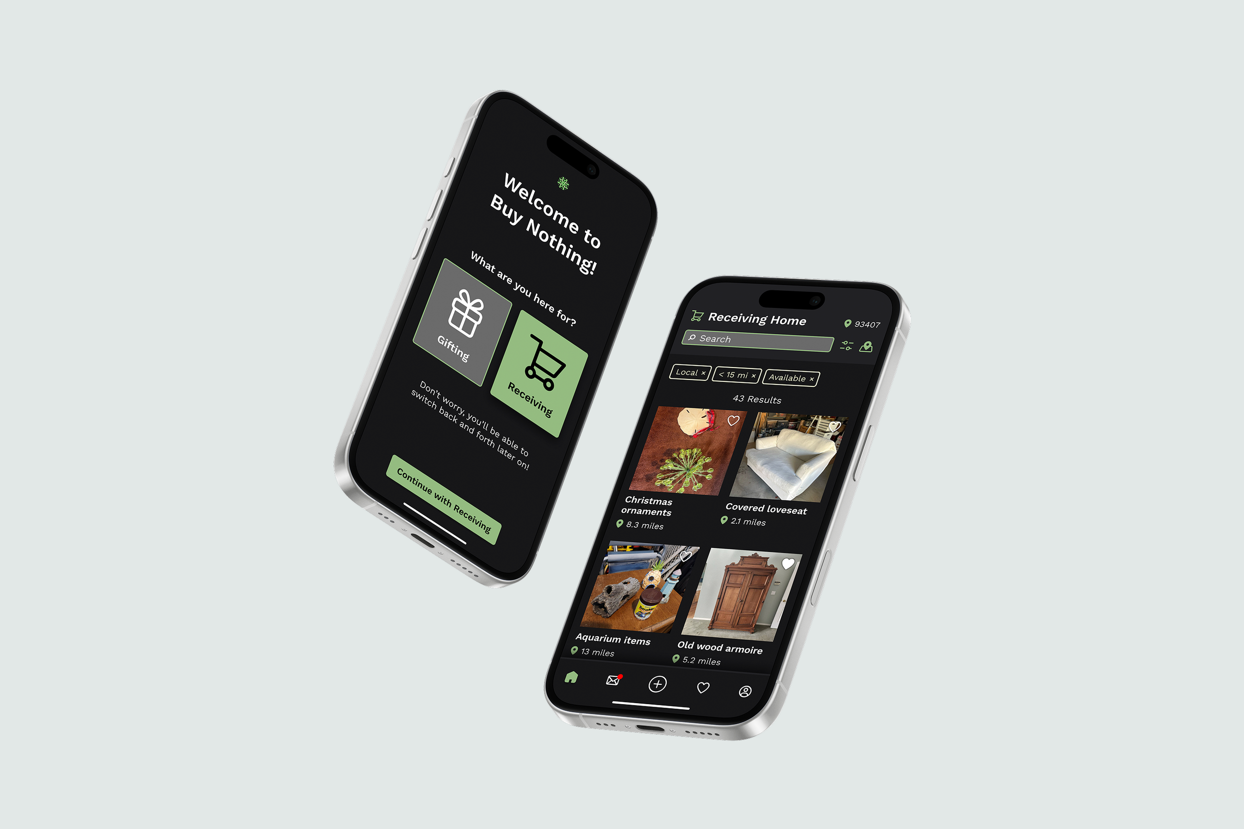
ACADEMIC PROJECT
Mobile Application Redesign
DURATION
2 weeks
Oct 2024
SOFTWARE
Figma
PREVIOUS DESIGN
Application prior to redesign: Some important information, such as listing titles and distance, not shown in initial search screen. Buttons and actions are not intuitive, and results filtering is extremely limited.
REDESIGN GOALS
My main goal for the redesign of Buy Nothing’s UI was to refine the structure of the interface. Most of this process was removing redundant information, clarifying text hierarchy, and adding features I felt were missing from the original application.
As far as the UX, the goal was to create a more clear and concise journey through the app, with a special focus on reducing the time it takes a user to find and reserve an item.
Pain Points
CONTENT ISSUES
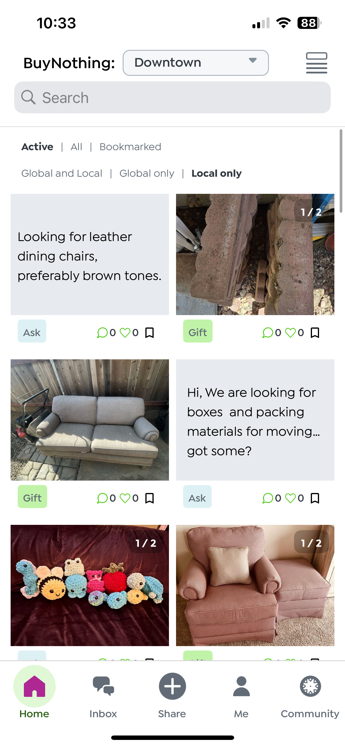
Listing cards are cluttered, containing excessive information and making navigation difficult for users. Locations have no map link, requiring users to hunt down addresses themselves. This prevents users from quickly estimating distance, which can be a primary factor when choosing an item.
ORGANIZATIONAL ISSUES
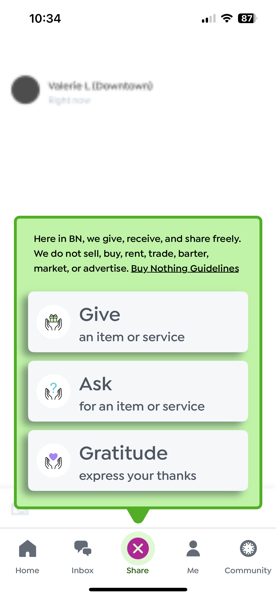
On the home screen, users have extremely limited filtering options. This is linked to a lack of tagging on the posting end, and causes users to receive high numbers of irrelevant results. There is also no system in place for reserving or picking up items, leaving users to private message back and forth. This is inefficient for all parties, and could easily be streamlined.
USABILITY ISSUES
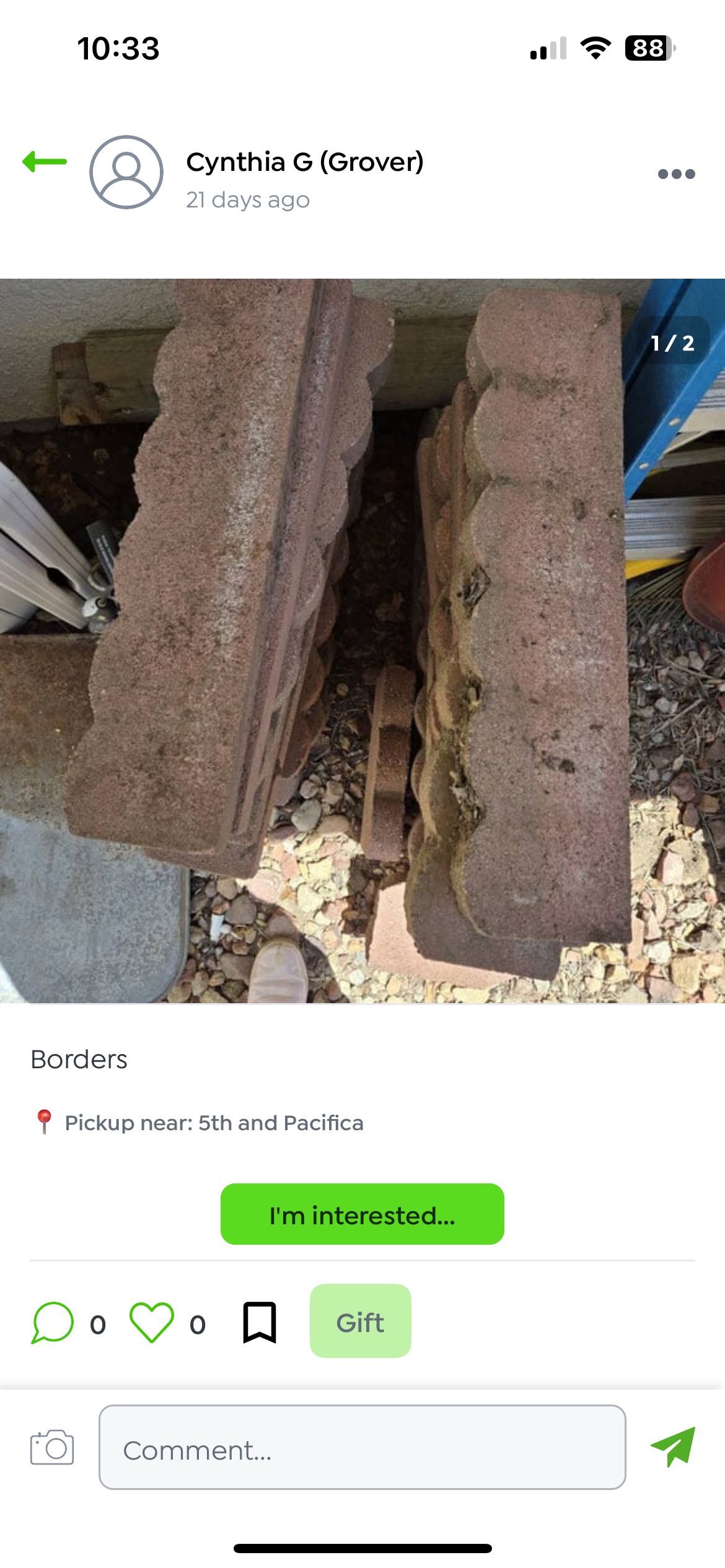
One huge security issue is that users’ full first and last names are available publicly. Because listings also include general locations, this poses potential safety risks for gifters.
VISUAL DESIGN ISSUES
Some screens have accessibility issues with light text on light backgrounds. Some calls to action are also unclear, such as the “I’m interested” button taking users to a comment section.
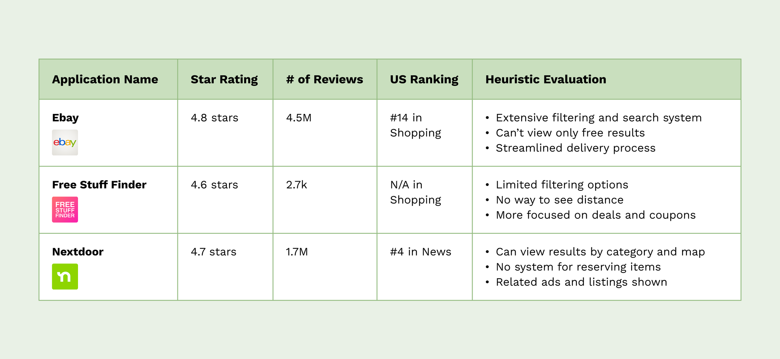
Competitor analysis
Comparison criteria included ease of finding/sorting results, ability to view results by location/distance, and ease of reservation and pickup process
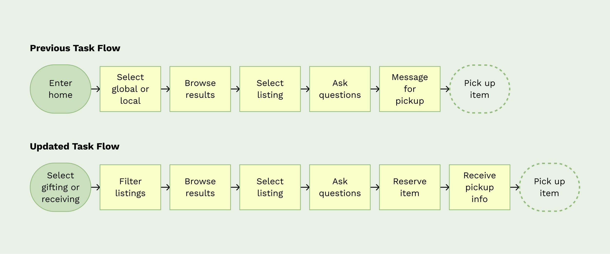
Task Flow Resolution
For this specific project, our objective Main change in task flow was including steps for reserving and picking up items. I wanted these tasks to be supported by the app’s functions, instead of forcing users figure out what to do on their own
WIREFRAME SKETCHES
Main focus on creating clear organization and structure of information
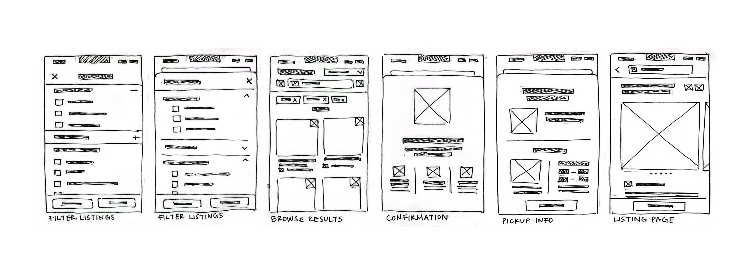
Final Solutions
Emphasis on creating information hierarchy, as well as integrating sorting and categorization features in order to make the user experience more intuitive overall
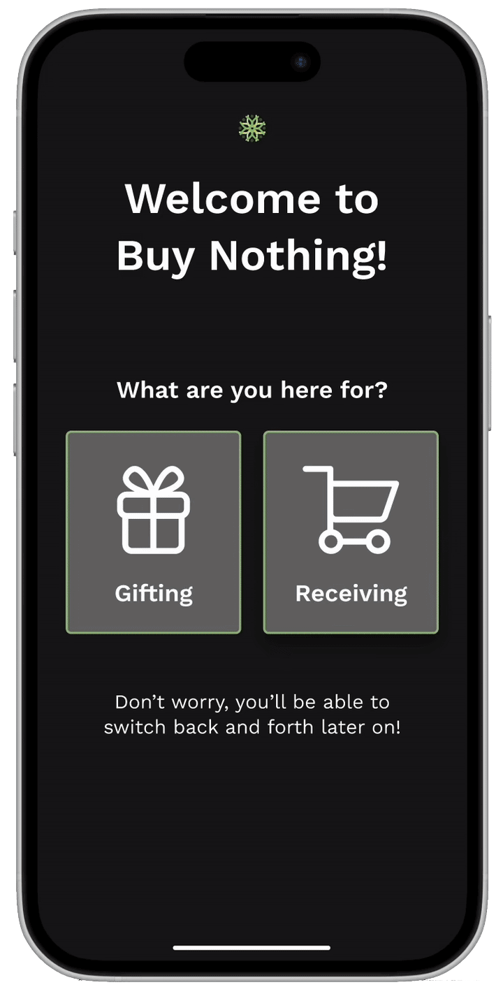
ONBOARDING
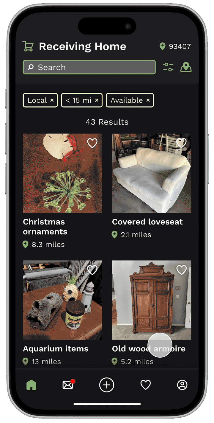
The original app separated all listings into two categories: requests and gifts. However, there was no way to see only one or the other, making the scrolling experience cluttered with irrelevant results. By integrating this separation into an onboarding step, this customizes the experience to the user’s current needs. A clickable icon in the top left of the home also allows users to switch back and forth with ease.
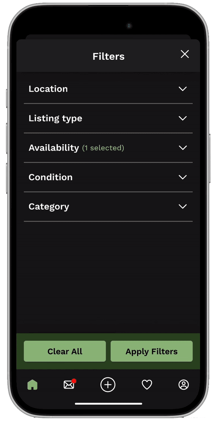
FILTERS
Another key feature that the original app lacked was a clear filtering system. Part of this issue is rooted in the listing creation task flow, which is not one I addressed in this redesign. However, we can assume that the addition of required categories in listing creation allows for the same integration in item filtering.
Arguably more important than categories was the distance range filter. Location and drive time are often key factors for shoppers, and including this as an filter option allows for increased relevance of search and browsing results.
LISTING PAGE
The main issue with this page was in the lack of clear differentiation between privately messaging a gifter and publicly commenting on the listing. CTA buttons were not intuitive and the steps were unnecessarily complicated. Moving the comments section underneath the description allowed for a more obvious distinction between the “add comment” button and the “message gifter” button.
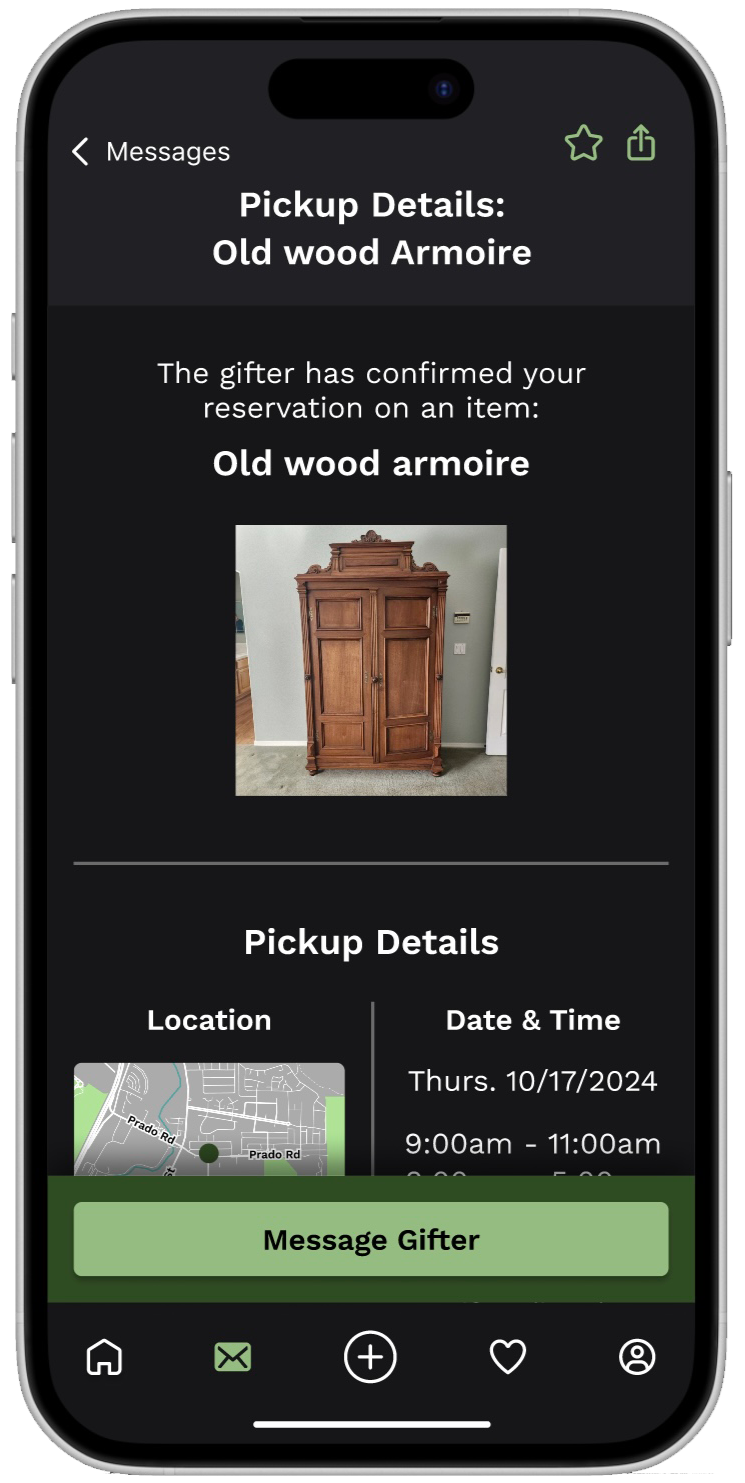
Reservation & pickup system
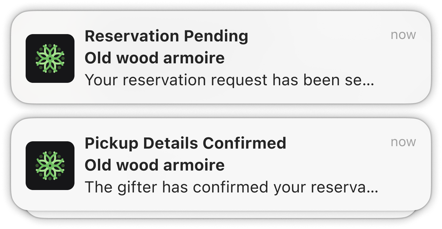
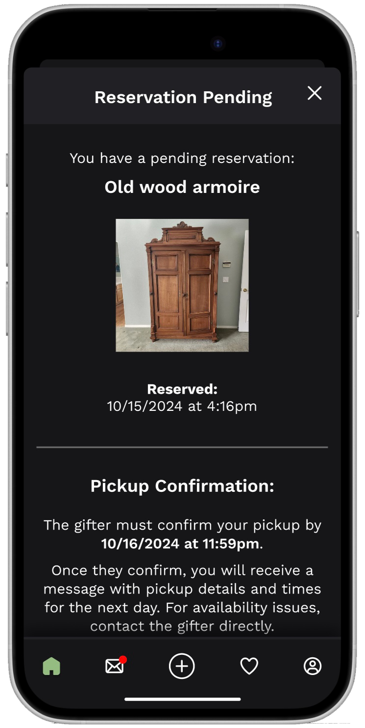
Though these steps of the task flow require little user action, I believe them to be the most important parts of the entire redesign. Systems for reservation and pickup were nonexistent within the app. In turn, this caused users to question whether items were still available and left them to message back and forth with gifters about negotiating pickup information. Because there was no structure behind these actions, the step to actually receive free items was inefficient and confusing for all parties involved.
To streamline this, I created a reservation system. Users can now reserve an item, clearly indicating to others that this listing has been temporarily claimed by someone else. From there, the gifter who created the listing has until end of next day to confirm the reservation and provide times and dates available for pickup. At this point in the process, direct messaging is provided, should scheduling availability not line up.
Complete with push notifications, this system makes receiving items quicker, simpler, and clearer. All of this ties back into the overall redesign goal of reducing time needed from app launch to item pickup.
Reflection
CHALLENGES
One big challenge that was on my mind when adding certain steps was user privacy and security. Especially with the addition of mapping features, I thought a lot about how to keep gifters’ locations private while still providing enough information for other users to get a sense of how far away a listing actually was. I resolved this by keeping location general on the public listing page, showing a neighborhood area instead of a specific address pinpoint. This allows gifters to only give specific pickup location once they confirm who will be receiving their item.
CONCLUSION
Analyzing this application gave me a unique opportunity to both identify successful UX systems and improve inefficient ones. I learned that adding steps can sometimes be better than taking them away, especially when those new steps simplify task flow and overall app navigation.