NOURXSH
Helping vegans & vegetarians maintain a regular and adequate protein intake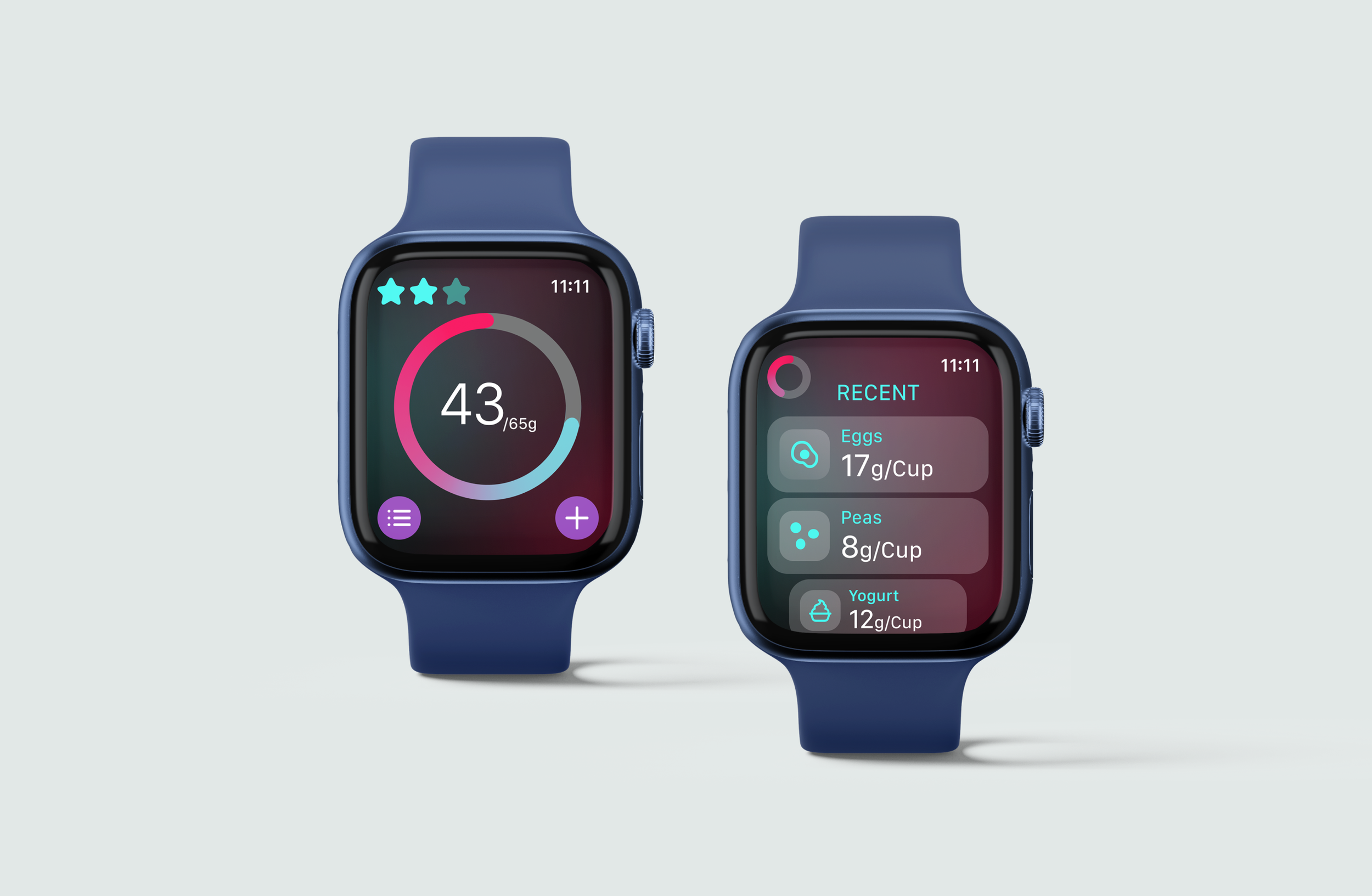
ACADEMIC PROJECT
Apple Watch Application
TEAM
Isa Cordovez
DURATION
2 weeks
Nov–Dec 2024
SOFTWARE
Figma
IDEATION
This project was an exercise in exploring the different capabilities and limitations an Apple Watch app has in relation to other mobile or desktop apps. Our app was designed to center around a single main function, with the option to incorporate features unique to the watch, such as heart rate monitoring, speed data, voice type, and more.
My partner and I decided to create an app focused on tracking protein intake, specifically for vegans and vegetarians. Narrowing our target group in this way allowed us to build the functions in the app with much more specificity and intention, and also brought more focus to our concept as a whole. Our application is distinct from other protein-tracking apps that have focuses on weight-loss or muscle-building, instead being designed to help vegans and vegetarians make sure they are meeting the minimum recommended grams of protein per day.
PROBLEM STATEMENT
Vegans and vegetarians have a difficult time tracking and maintaining adequate protein levels throughout the day, ultimately affecting other functions in the body such as muscle maintenance and alertness. How might we create an app that not only tracks overall protein intake, but also encourages protein intake that is consistent and regular?
SKETCHES
Exploring how to adjust information and application functions into a smaller screen size, with special focus on information hierarchy and how functions have the potential to change when a user interacts with a device this size
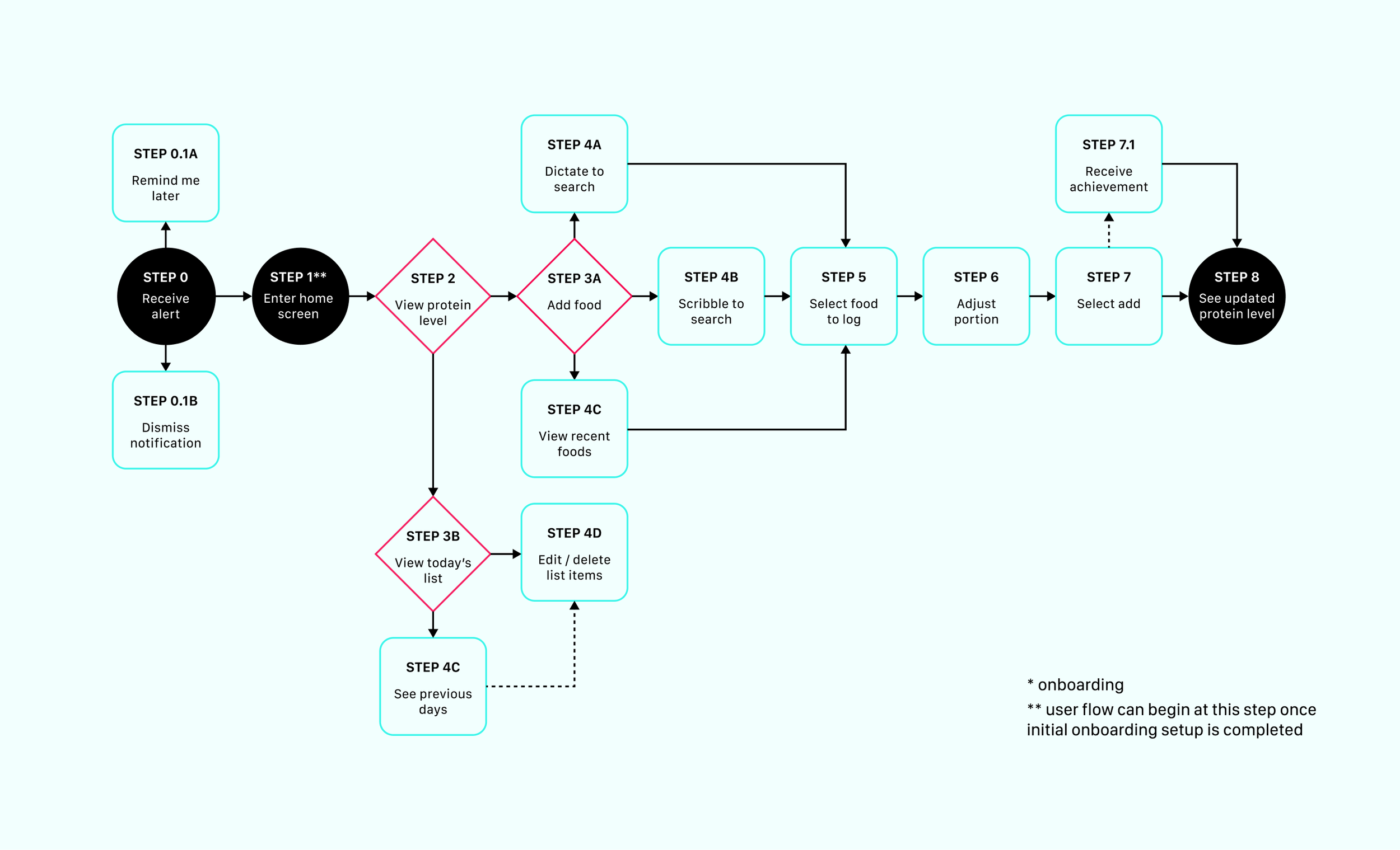
user flow
Full build-out of the application’s entire user flow, with focus on creating routes that could be followed in small moments, allowing users to easily shape their experience around their own availability and schedule
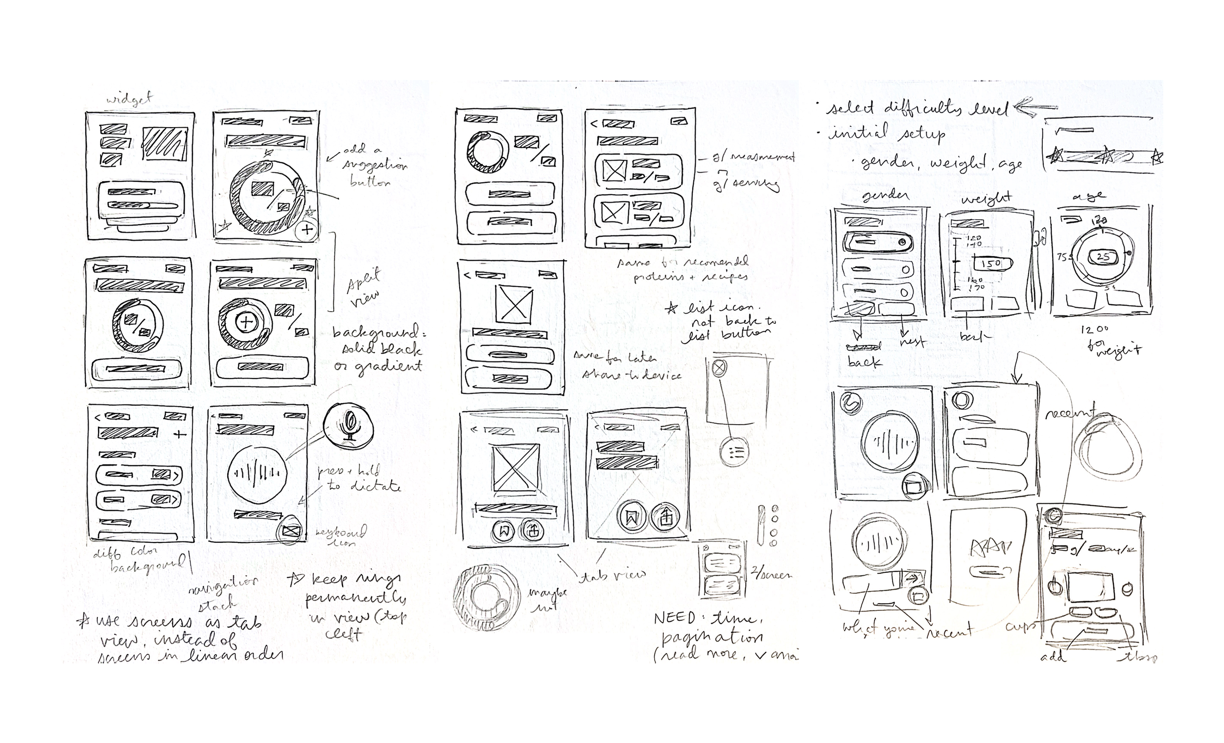
WIREFRAMES
Following the main task of adding a food to the protein tracker
Final Solutions
In our final solution, we put priority on organizing features in a way that makes them accessible to the Apple Watch screen size. Keeping this at the front of our mind gave us structure to build our typography hierarchy, choose how to display certain features or selections, and narrowed down what information we decided to include on each screen. All these pieces come together to keep users conscious and intentional about their daily protein intake


tracking & notifications
Our app was designed to work around each users’ individual schedule, since tracking protein tends to be a low-priority task in comparison to other daily tasks. To keep our app relevant throughout the day, we included notifications that alert to low protein levels, allowing users to add a food on the spot or delay notifications to a time more convenient for their schedule

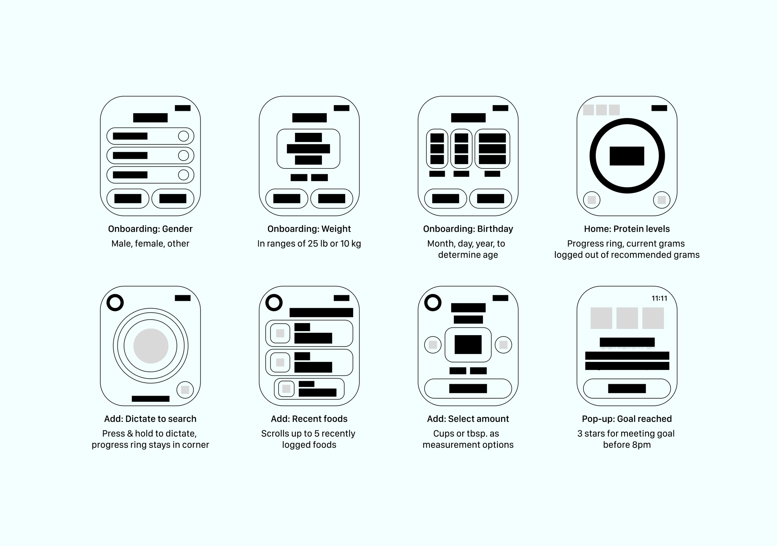
ONBOARDING
Customization of recommended daily protein levels, dependent on qualities like gender, weight, and age. At this point in the application, we create a distinction between our app, by excluding questions about weight-loss or muscle-building goals


add food


Working around the issues users have with writing on the small Apple Watch screen, we defaulted our food logging to work with voice dictation, with secondary options of writing or seeing recently added foods. Once a food is selected from the results scroll, the measurements and amounts are customizable with easily-accessible scrolls
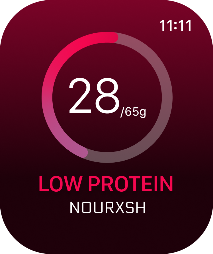
The home screen on our app is centered around two main features: the three-star system and the colored rings.
The stars give users stepping stones towards achieving their greater goal, marking one-third, two-thirds, and completion of the protein goal. The watch app could be linked to a mobile app where users could customize what time they want to meet their protein goal by. Each star achieved is rewarded with a “congrats” notification.
The ring-color system is responsive to the time of day. The colors (pink or teal) correspond to the calculation of grams consumed to time of day, with pink indicating low protein level and teal being an adequate level. So while the ring might be teal at one point of day, as the time progresses, it slowly turns more pink if the user doesn’t consume more protein. Full teal signals full completion.

Stars & Rings systems


Reflection
CHALLENGES
The biggest challenge my partner and I faced during this project was that neither of us had ever used an Apple watch, or any other smart watch, before. Because of this, we had to be much more thorough in our research during the sketching and wireframing stages. It was difficult at times to build UI for features we had never personally used, but I think it was also so interesting to think through our process from an outside perspective. Luckily, once we reached final designs, a friend lent us one to interact with. This personal experience paired well with our earlier, more un-biased design steps, ultimately leading to a final design that balanced user preferences with overall efficiency.
CONCLUSION
Overall, this project was an interesting exploration into an unfamiliar realm of UI/UX design. Wearable technology is something I’d definitely be interested in designing again in the future. Compacting functions and information onto such a small screen was a super fun line of critical thinking to work through.